Part 1: Sketching and Usability Testing
Design: The idea for this project came from a previous sketch I had done for HCDE 418. As a college student of the legal drinking age, I often find myself saying, "Man, I could really use a beer right now!", yet for any number of reasons (it's raining out, I'm tired, I have homework, etc.) I can't or won't go out and get beer. Hence the birth of "BeerMe". In essence, my goal was to create a one-stop "beer" button that would allow the user to order some amount of beer and have it delivered right to their doorstop.
I started by thinking about what factors would be necessary for a beer delivery service. While I had originally imagined it as a "push a button" type of deal, I ultimately decided that I change varieties of beer enough (and that as I wouldn't be the only user) that I should allow for the beer type to be specified each time. Naturally, following type, would be quantity, and price.
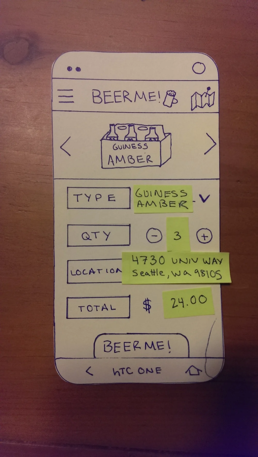
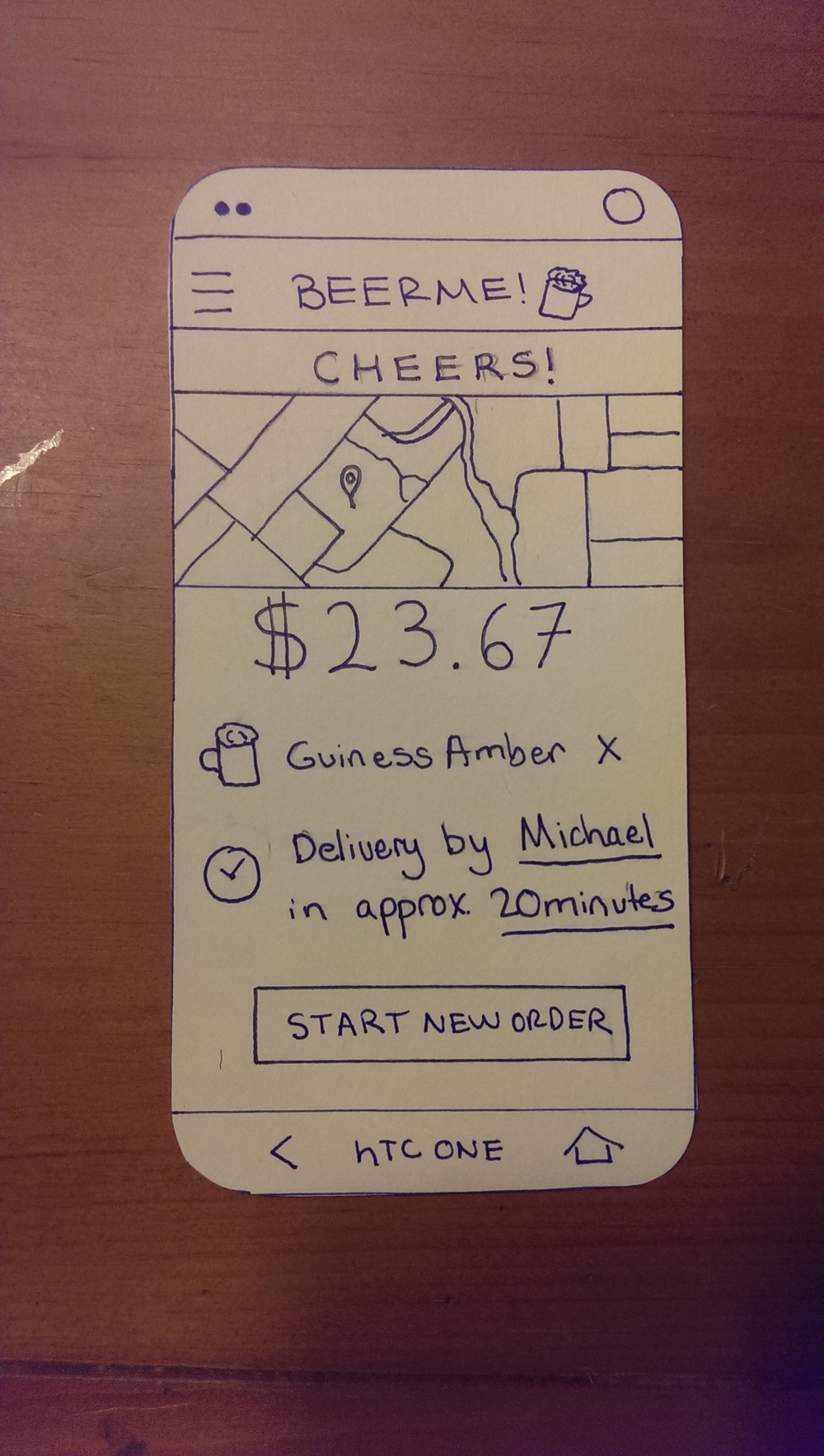
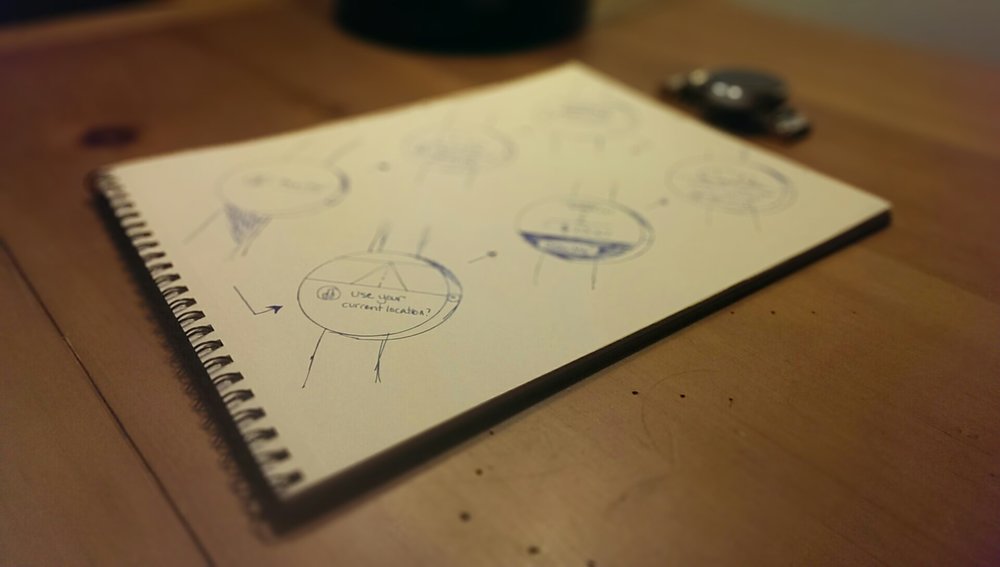
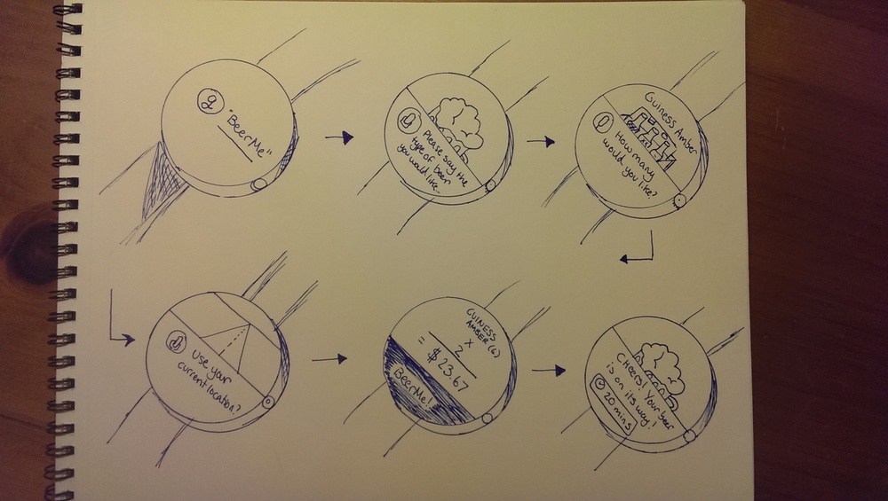
Prototype: To test this out, I looked over my previous sketch, and decided to move forward with that rough design. I created three "phones", and sketched a (very) rough pathway the user would take through the app, starting with the splash screen, an ending with a "receipt" or thank you page. I also did a smartwatch walk through sketch, detailing what each screen might look like, though limited my user-testing to the phone unit itself. I used sticky note cut-outs to show changing values based on user input (with things like beer type, quantity, and address). Because this is intended to be a very simple overall process, one of my main goals was to design it in a way that would transition with relative ease to a smart watch platform. I decided that using your voice for the smartwatch would be the best approach here, as I wanted to keep it as simple as possible.
USER TESTING: When the user testing took place, it was clear that the user could grasp the concept here fairly fast, and was able to navigate through it with relative ease. However, there were several issues that also surfaced relatively fast as well. While users were able to navigate through the app fast, the question of payment methods arose almost at the get-go. I had envisioned this as something that a user would enter their payment info into once, and then not have to worry about it again (furthering the one-stop shop idea), though had forgotten to explain this aspect beforehand. Thus the first user was concerned with how to deal with that, though having explained the situation to the second, he proceeded without conflict. Another issue was entering the location, though that was more of a problem with the limitations of a simplified paper-prototype. My second user suggested having a quick "map" or "pin" icon right at hand that would automatically pull your location details. While I liked this idea in concept, one would also need to consider that a location isn't good enough when considering housing units like apartments, where you would need the apartment number as well. Ultimately, I think it would be nice to see a fusion of those two ideas working together.
A second, and probably the biggest issue that we uncovered was that, as it stands now, there was no way for a user to purchase different types of beer simultaneously. This could be fixed through the implementation or metaphorical equivalent of "shopping cart" or something along those lines, in which a user could view what they'd like to purchase, as well as add additional items as they see fit.
However, both users were able to navigate through the app without issue, which leads me to believe that my design, while lacking in some areas, was at least clear and easy to use. Because this was a fairly time-consuming task to create these phones, I think in the future I would have to create an easier method to fully flush out the application as a whole (such as the multi-screen method of sliding a long horizontal or vertical piece of paper through a "unit" to simulate user flow and movement.
Additionally, I found that while users appreciated the sound-feedback on button clicks to indicate a successful press, ultimately it made them end up laughing too hard, which inhibited the user test as a whole. In the future, I would either make this optional, or remove it entirely.
Smartwatch concept user-flow
Part 2: Mockups and Prototypes
The core concept of BeerMe, which started as a joke, but quickly arose into a challenging idea, came from a simple question: why isn't there an app that will let me purchase beer, and have someone deliver it to my door? I wanted to take this idea one step further as a quick and fun exploration into the mockup territory.
I started by going back to my paper prototypes, and looking through my paper design. I actually ended up retaining quite a bit of the aesthetic design from the originals, with a few core exceptions. Primarily, my design process involved moving from "black and white" to color, and creating a much more seamless, wholesome experience:
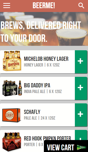
- I switched the "home" page immediately after the splash screen to being a much more in-depth explore screen, that had a list of beers available along with their quantity and Oz count, a search option, and the ability to add a beer to your shopping cart while still browsing products. This served as the fix for the large issue in my original design -being able to purchase multiple types of beer at once (and not just multiple quantities of the same item).
- I added a payment option in the hamburger "side" menu that would allow users to add a new payment card if they wanted. However, I did feel it was important to retain the "one-stop-shop" idea, and have them add a card once and have it be automatically charged, like in Uber and Lyft.
- The location issues was fixed by using a combination of a map pin, and the ability to choose a specific location. Once you had established items in your shopping cart, and you move to the next screen, you are able to click on a map item to choose a pin, as well as select a specific address using the button next to it.
I started by building out the explore page, and based all the other screens off of that. This included choosing the font, selecting a color scheme, and geometric decisions (rounded, rectangles, etc.). I ultimately decided to use Bebas Neueu as my primary font, and went for a slightly off, muted color scheme that included a soft red, green, and blue, and relied heavily on white space and contrast to help differentiate objects within the screen.
Reflection
I was pretty happy with how this came out, overall, and felt like, with a little more work, I would consider highlighting this as an example of what I could in a single day of "quick turnaround" prototyping. Although I built it in Axure, I did two different methods of testing it. The first was to use Axure's built-in ability to view it on a mobile device. Coupled with using Chrome's "Add to Desktop" feature, this proved to a very effective way to test it, because it would appear as if it were a real app, and open on the device like one. Although I had some initial problems with the scaling, with trial and error I was able to make it fit my device's screen perfectly, and make it look 100% like an app.
In the Future, I...
Would really love to see if I could figure out how to make the Axure version run more smoothly on my phone. I felt that although POP is great, because I put so much time and effort into make these awesome animations and transitions, they should really be showcased on the prototype. Also, because I only did this in one day (I was forced to do it early because of too much other homework and work obligations) I felt that some of the design was a little bit too cluttered, specifically the order page. I didn't feel like there was any information to take out, as it's all needed for a order confirmation, so I would have like to experiment with the design a bit more that would enable me to "calm" things down on that screen. But overall, I was really happy with this design, and am super glad I took the time to go back and look through the mistakes from my first design. Iterative prototyping definitely has its advantages!


