
After establishing a review of the current mobile design realm, we started by establishing four, core goals that would help track, refine, and inspire our work.
The four we ultimately decided on were:
1) Minimalistic
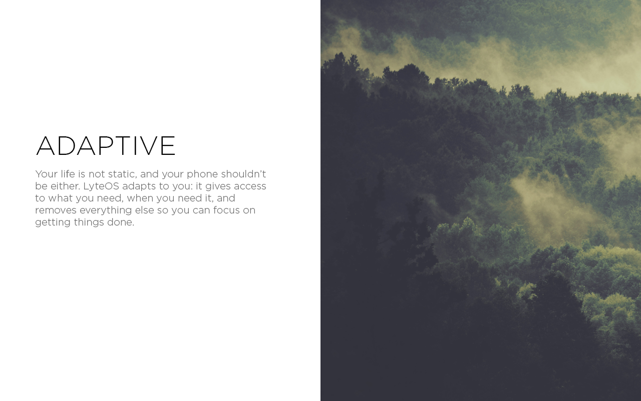
2) Adapative
3) Obtainable
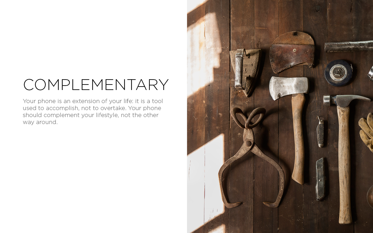
4) Complementary
Style Guide & Color Scheme
After establishing our overarching non-tangible goals for this project, our next step was to develop a style guide that would encompass Cardinal as a whole. Ultimately we decided that Karla, a free, open-source font, was an excellent choice as it read well large or small, as well retained clarity with stylings like Bold or Italic and differing colors.
We also developed a 5-step grayscale color wheel, and a set of 5 primary colors that would comprise of the majority of our color use throughout our app design.
Skeleton
The idea to develop a single "Skeleton" to define the underlying base of each application was, in my opinion, the single factor that contributed the most to our success in creating Cardinal. The Skeleton was a predefined set of rules, measurements, aesthetics and navigational processes that represented the foundation of every app we made as a team. This meant two very important things:
- We could all work independently on different apps, but would know that no matter how different our personal aesthetics choices were, at the end of the day, every app was united and familiar under a single architecture
- As soon as a user learned how to use one, they could then jump to any app in any category and be assured that the fundamental navigation flow, interactions, and design choices were familiar and the same
Overall, i believe that this not only made Cardinal seem like a single, cohesive system, but saved us an incredible amount of work time and man hours needed to ensure Cardinal felt like and looked like one operating system.
Lock Screen & App Drawer
The Lock Screen and App Drawer were one of the very first things I did as we began to conceptualize what Cardinal would look like. These screens were mostly experimental, and intended to get our brains thinking about design as a whole, and, most importantly, to get us ready for the important work on the actual apps themselves.
The top bar icons, the clock, power, and WiFi, were designed and created by myself in Illustrator; the app iconography was taken from a pre-made icon pack.
Gallery
Our goal as I was designing the Gallery and Camera applications was really not to try and "reinvent the wheel" as it were, but rather to rely on existing effective design patterns, and exercise conscientious design that took the usability as the highest factor.
The unique aspect we integrated was entitled "Memories". Memories revolved around the idea that some of the best moments are the ones we share with others. With Memories, we wanted to make it extremely easy to create albums that could be shared with others (and that others could contribute to as well).
Camera
Media Player
Developing the aesthetics of a "Media Player" for Cardinal proved to be the most challenging and extensive portions of the project I did, but also undoubtedly the most rewarding.
With so many unique and powerful media players in the current marketplace (Spotify, Apple Music, Google Play Music, etc.), the Media Player represented both a great opportunity to identify UX challenges and shortcomings in the current offerings, yet also meant finding a unique "aesthetic" and standing out from the rest was incredibly difficult. Considering the extensive amount of content that creating a media player constitutes, the longest and most demanding portion of designing this app was really in defining the underlying information architecture that was the user paths and interaction links.
While our "Skeleton" ensured that all our applications, though visually different, had the same overall look and feel, we realistically had a maximum of four tabs for content navigation on the bottom of the app. However, there were far more than just four main content areas a user would need to navigate in this, so structuring the information architecture in a way that logically made sense, yet still promoted a smooth and seamless user experience was an incredible obstacle to overcome.
Calendar
One of the main pain points that manifested itself when we started discussing our busy lives was that although calendars and to do lists are almost always isolated applications, in reality, they are tightly integrated and intertwining across multiple areas. This epiphany of sorts resulted in the meshing of the calendar and do list into one single app to increase productivity and enhance the overall user experience. The Calendar portion is broken down into two categories, the "Today" tab, and the Calendar tab. The Today tab allows you to get a cohesive, single look at what your schedule looks like for a single day. Swiping down moves you to the first Calendar view, a day schedule along with a quick view of the week, swiping down again reveals a whole month view along with your current day schedule, and a final and third swipe hides your daily schedule and reveals a multi-month view.